Colour selection.
I tended to make the eyes pale yellow because I wanted them to 'glow' slightly like predator eyes in the dark
I experimented with mainly tuxedo-like colour schemes for the main clothing because orchestra performers typically wear tux-like formal wear.
I decided on the fourth colour scheme because red made the character look too gaudy as seen in colour scheme 1, and the addition of purple offset the gaudy feel and added a tint of chaos and playfulness, as it looks a little like purple wine stained red satin like he lost control of his drinks one night and rolled with it.
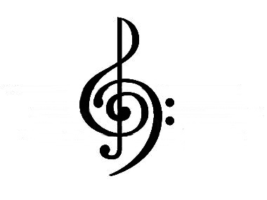
I played around with existing treble/bass cleff fusion designs
And toyed with putting it on the mask, but decided not to.
Digital turn around with chosen colour scheme.
Scale of table to character
I decided to have 3 sets of chords since small, portable keyboards typically have 4 sets of chords but then it looks too crowded and confusing on the table.
I chose my knives from this informative selection


No comments:
Post a Comment